
In one of my XPages projects I use bootstrap tabs to make it user friendly. One down side is that on different tabs are required fields, so when the validation failed there is no clear overview which fields need to be filled in.
On the web I found the JQuery project, form validation, with a nice example how to show a icon on the tab if the validation failed on the tab.
Stephan Wissel had an example on his blog to set focus to the first field which has failed the validation.
These two examples I have combined in a small piece of javascript code and has put it in a script block.
1 2 3 4 5 6 7 8 9 10 11 12 | $(document).ready(function() { $('[aria-invalid=true]').each(function() { var $tabPane = $(this).parents('.tab-pane') var tabId = $tabPane.attr('id'); $('a[href="#' + tabId + '"][data-toggle="tab"]') .addClass('has-error') .parent() .find('i') .removeClass('fa-check') .addClass('fa-times'); }); }); |
And I have a small piece of css code for the styling
1 2 3 4 5 6 7 | .has-error{ color: #a94442;}.nav-tabs>li.active>a.has-error, .nav-tabs>li.active>a:hover.has-error, .nav-tabs>li.active>a:focus.has-error { color: #a94442; } |
The last thing is to add to the tab a font-awesome i tag
1 | <i class="fa fa-check"></i> |
With this result
[dropshadowbox align=”none” effect=”lifted-both” width=”400px” height=”” background_color=”#ffffff” border_width=”1″ border_color=”#dddddd” ]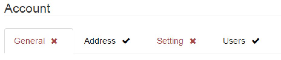 [/dropshadowbox]
This is a great usability enhancement!